Tuck Construction
Services
Along with shortening their name to OTC, the brand was doing the business a huge disservice - neither representative of the quality of their work or the personal relationships so critical to their success.
They had also identified a growing demographic of homeowners who really care about design-led spaces, just at a smaller scale. The challenge in attracting these customers was that OTC’s reputation preceded them, with many assuming they only built large-scale homes.
A rebrand was needed to further strengthen their credibility with high-end clientele, while making the business more accessible to homeowners who appreciate the detail and craft it takes to create considered spaces at any scale.
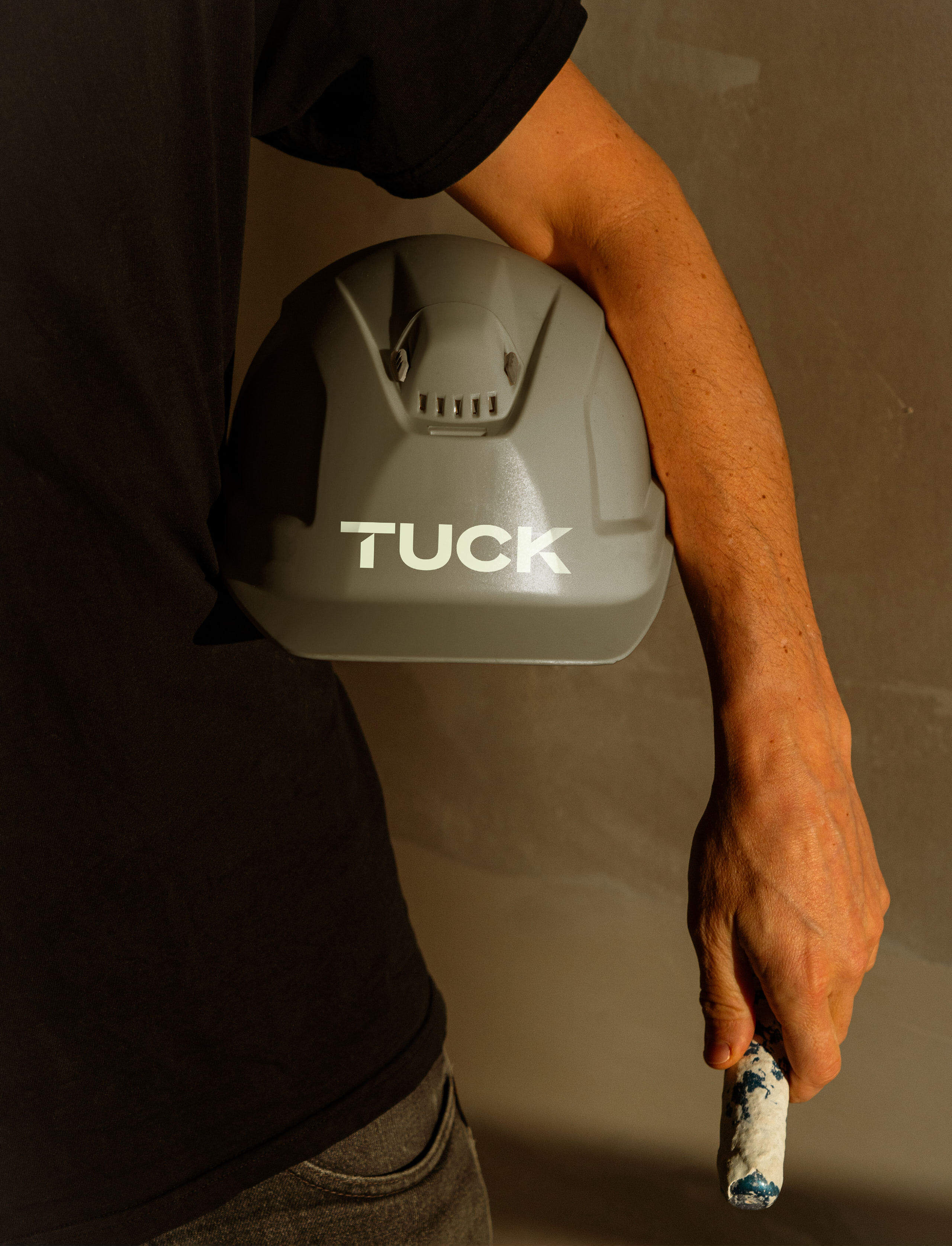
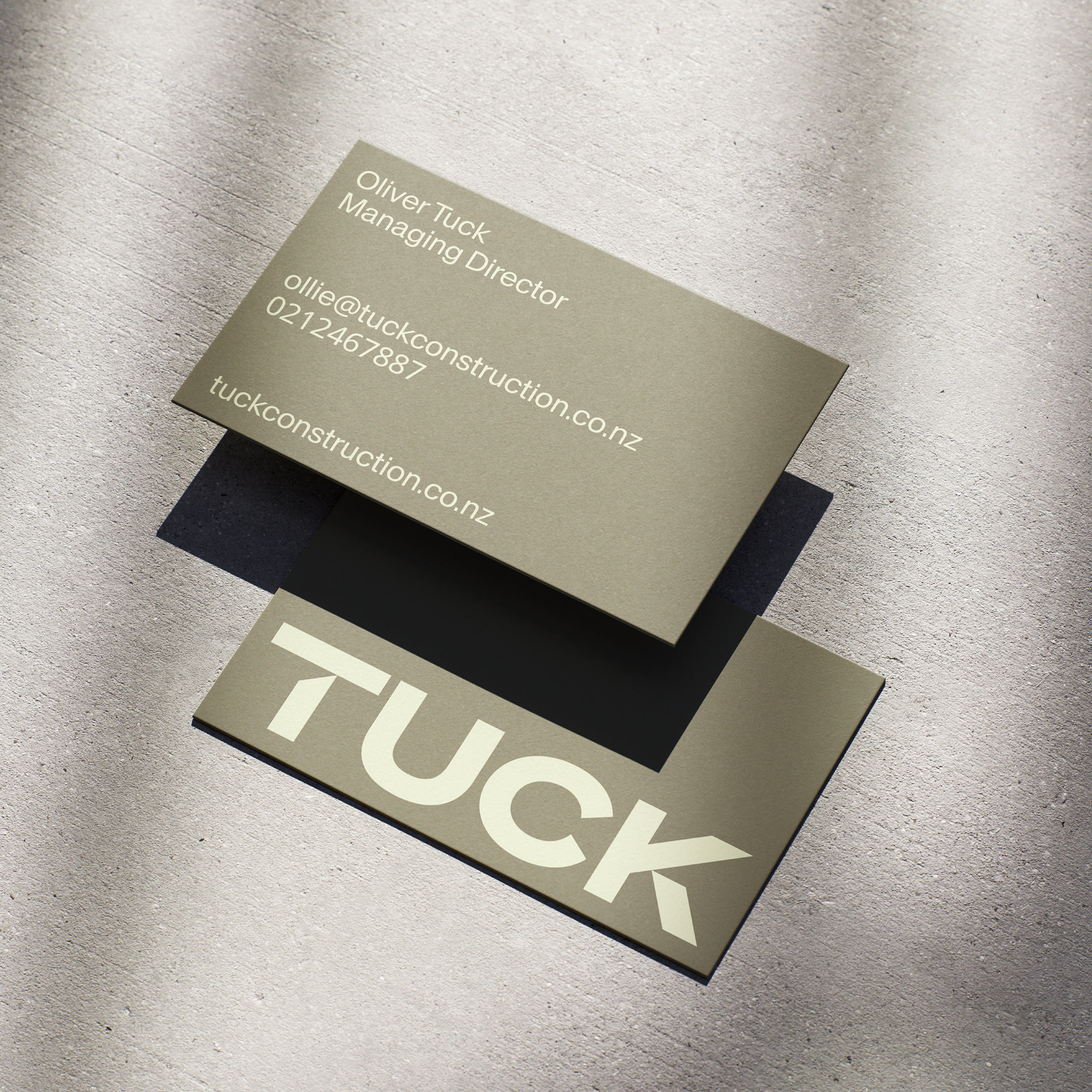
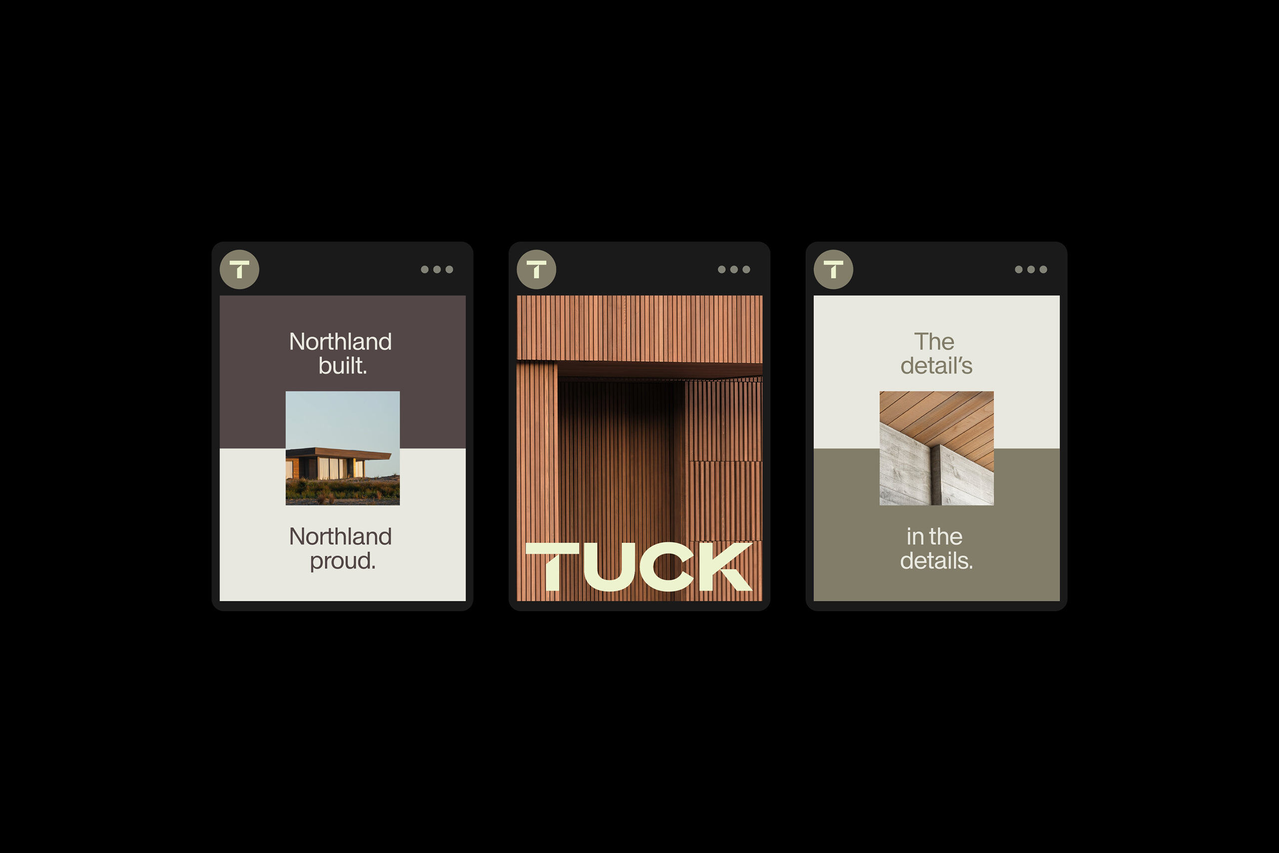
To begin, we changed OTC to Tuck. A contemporary, personal name that feels premium without feeling out of reach. Then developed a suite of key messages aligned to the commonality across both groups of homeowners.
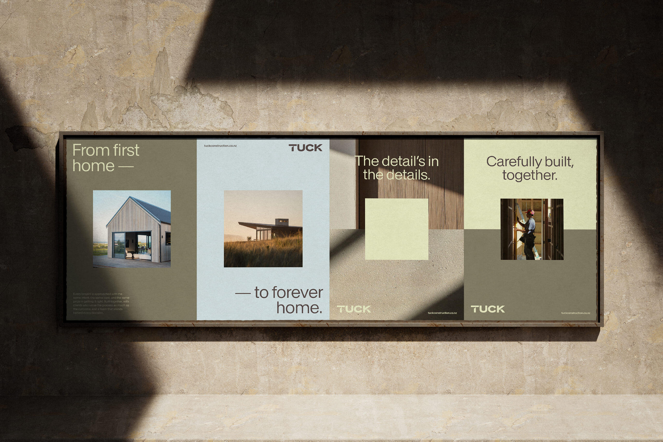
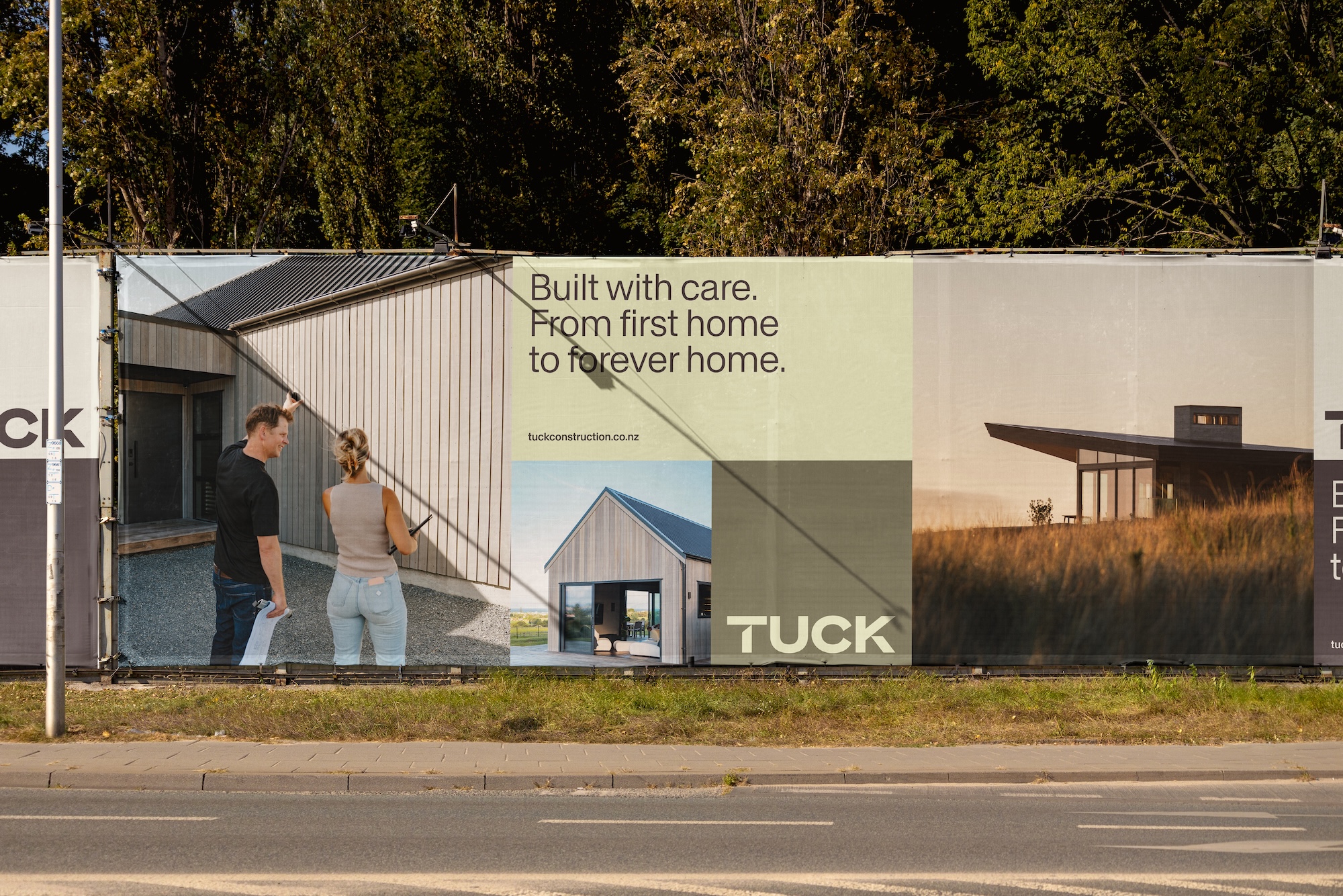
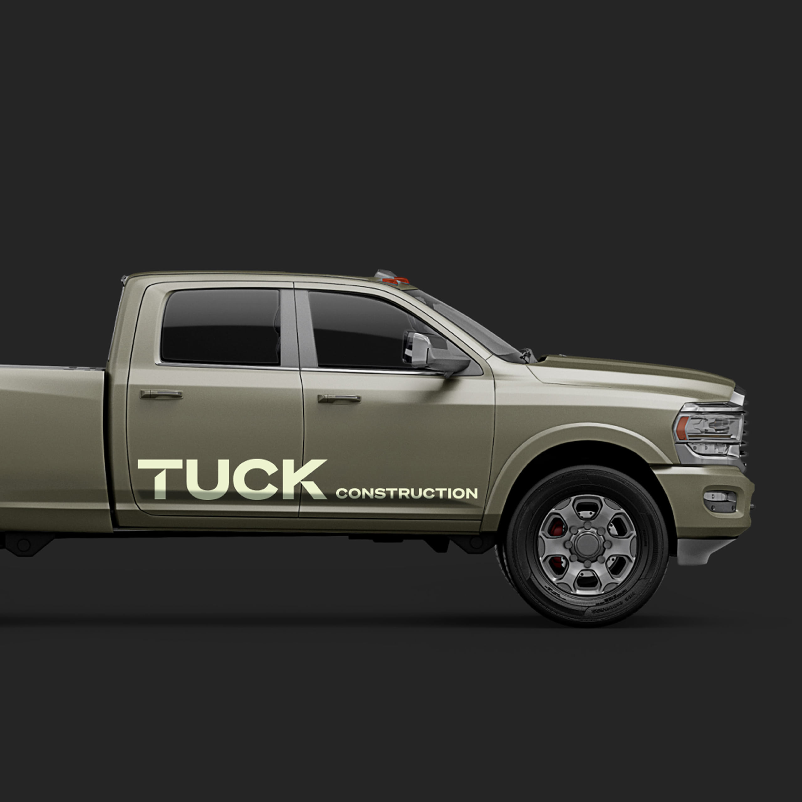
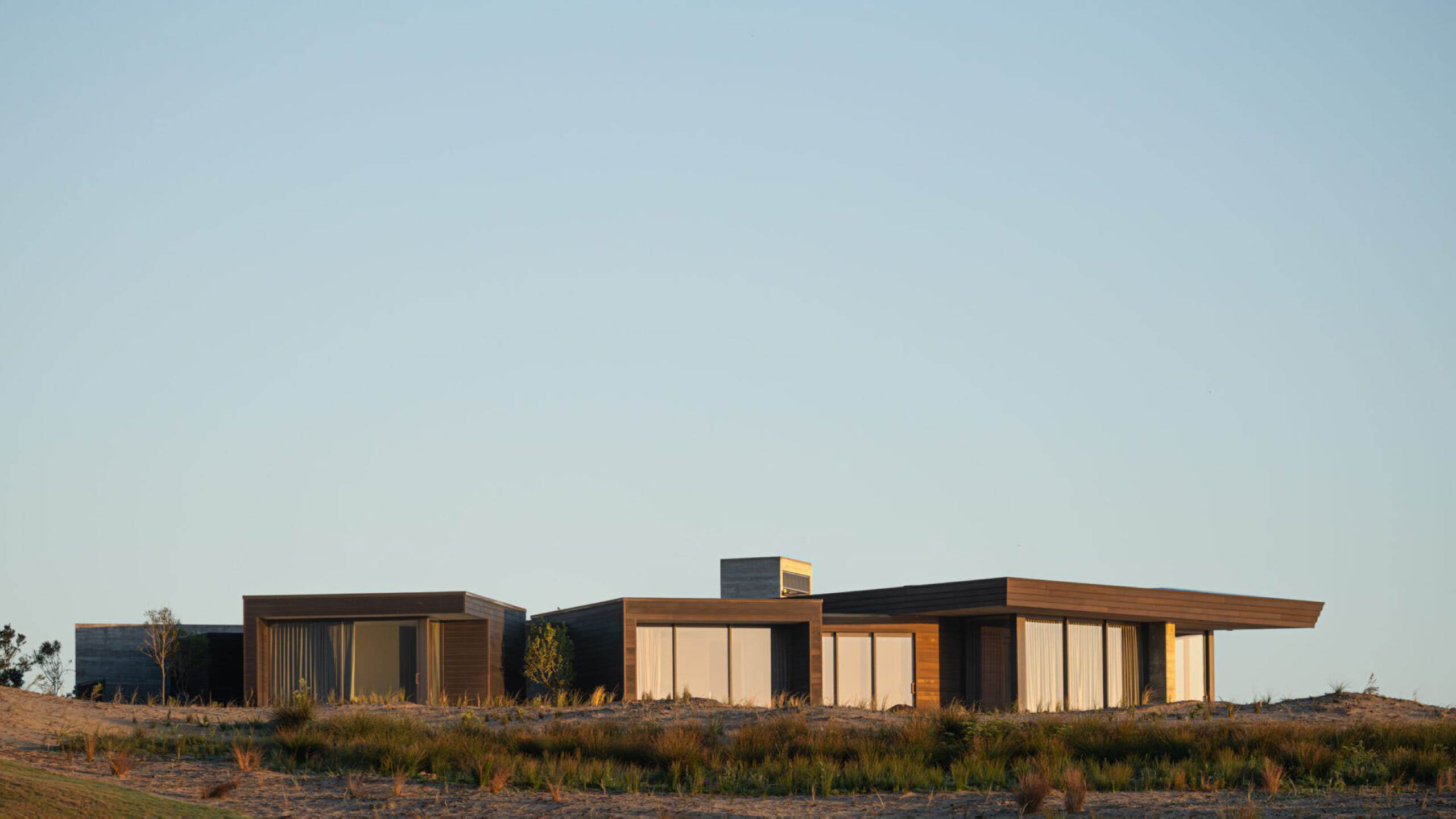
Like the name, the identity system needed to be adaptable, working just as well across editorial spreads and award submissions as it does in advertising and on-site applications. It was also important that the brand retained a strong sense of place, with colours drawn from the Northland coast the company calls home.
The final outcome is a brand designed to broaden the opportunities for Tuck, while ensuring what makes them distinctly them, is never lost.