Southpac Rebrand & Website
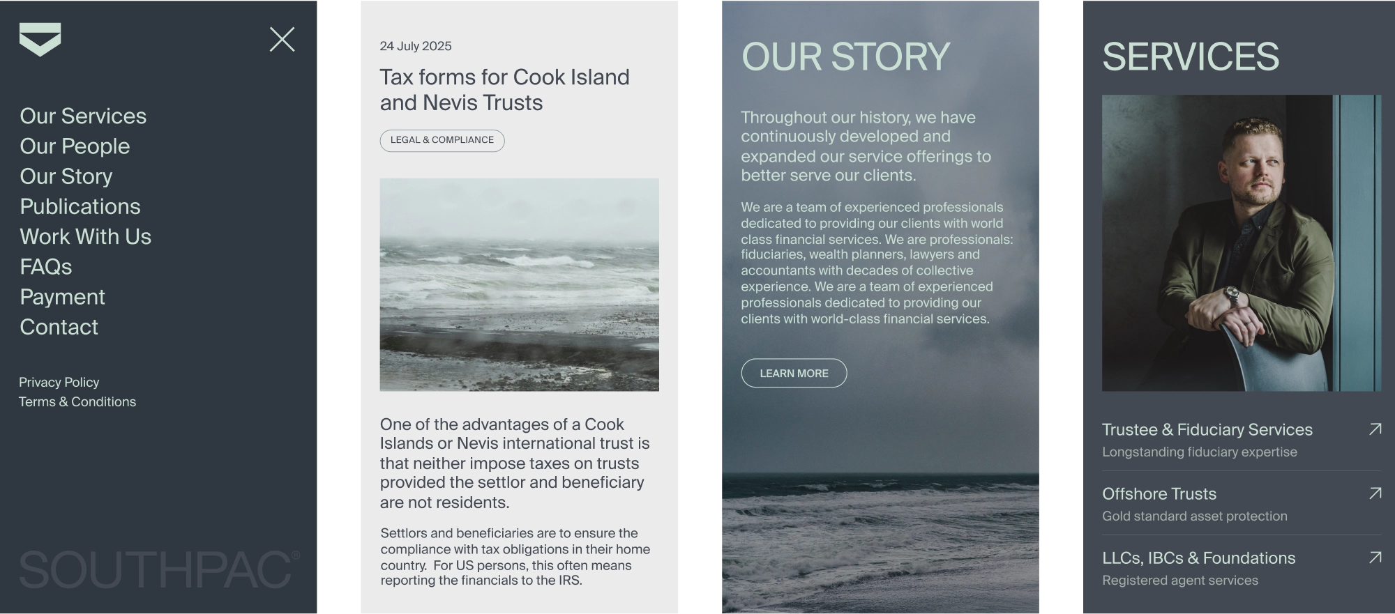
Services
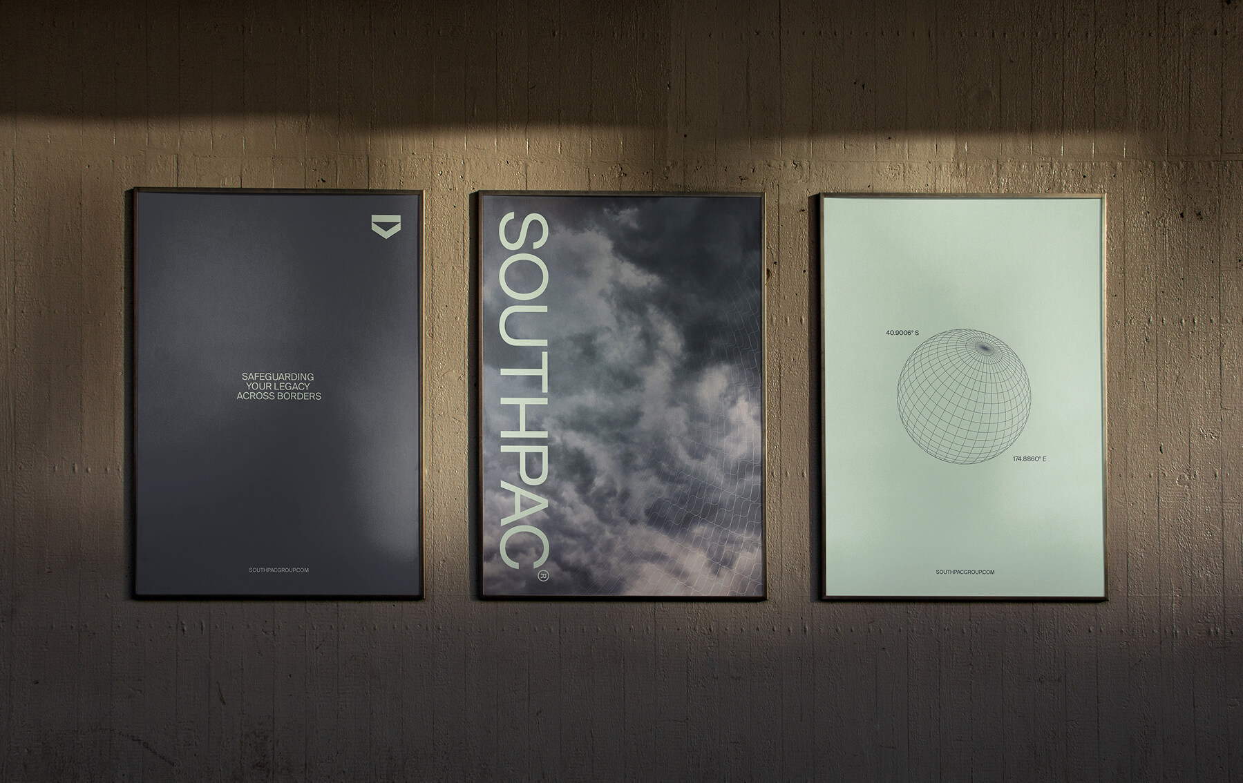
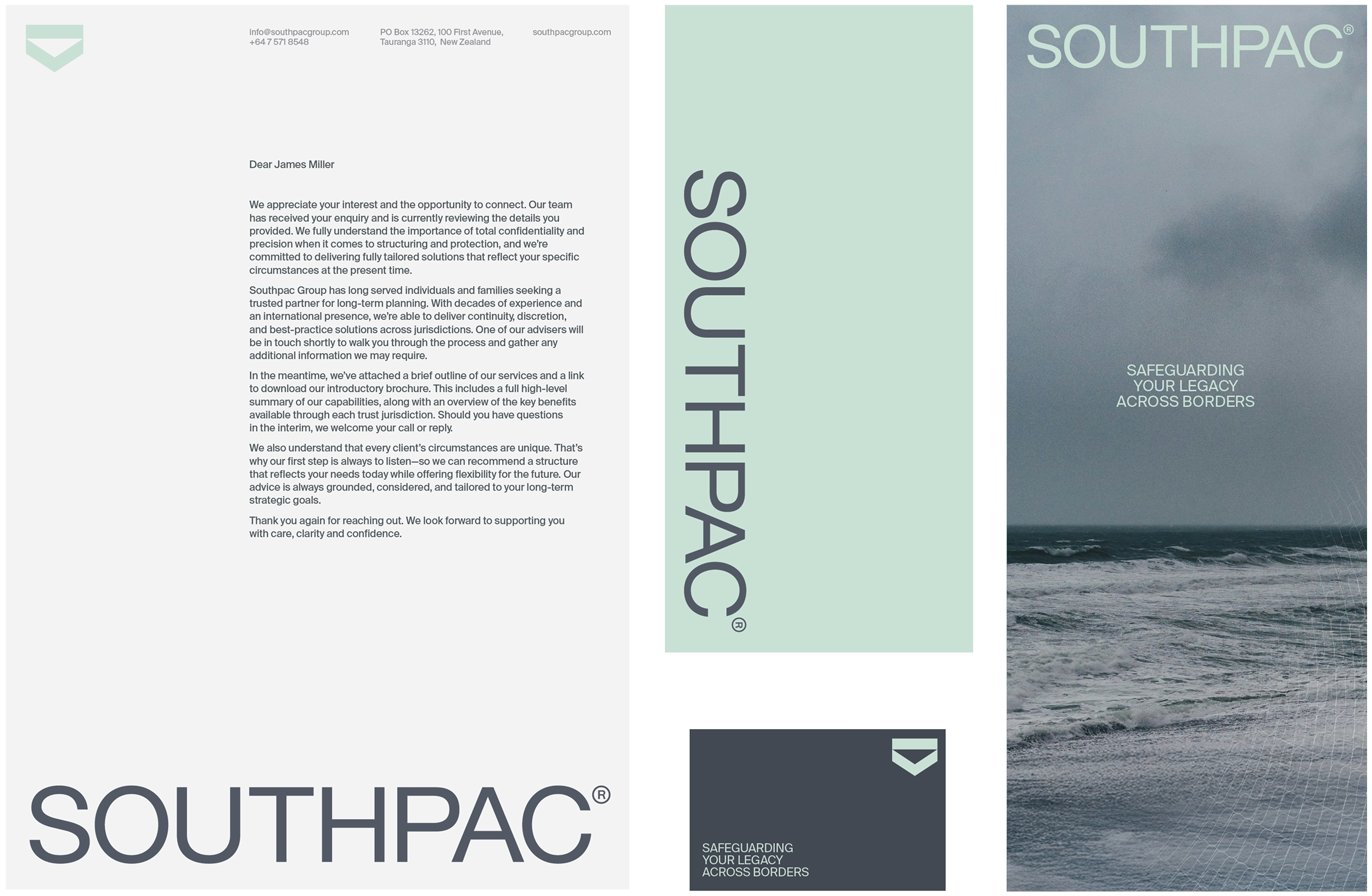
We reimagined Southpac’s brand system to honour its legacy while engaging a new generation of clients.
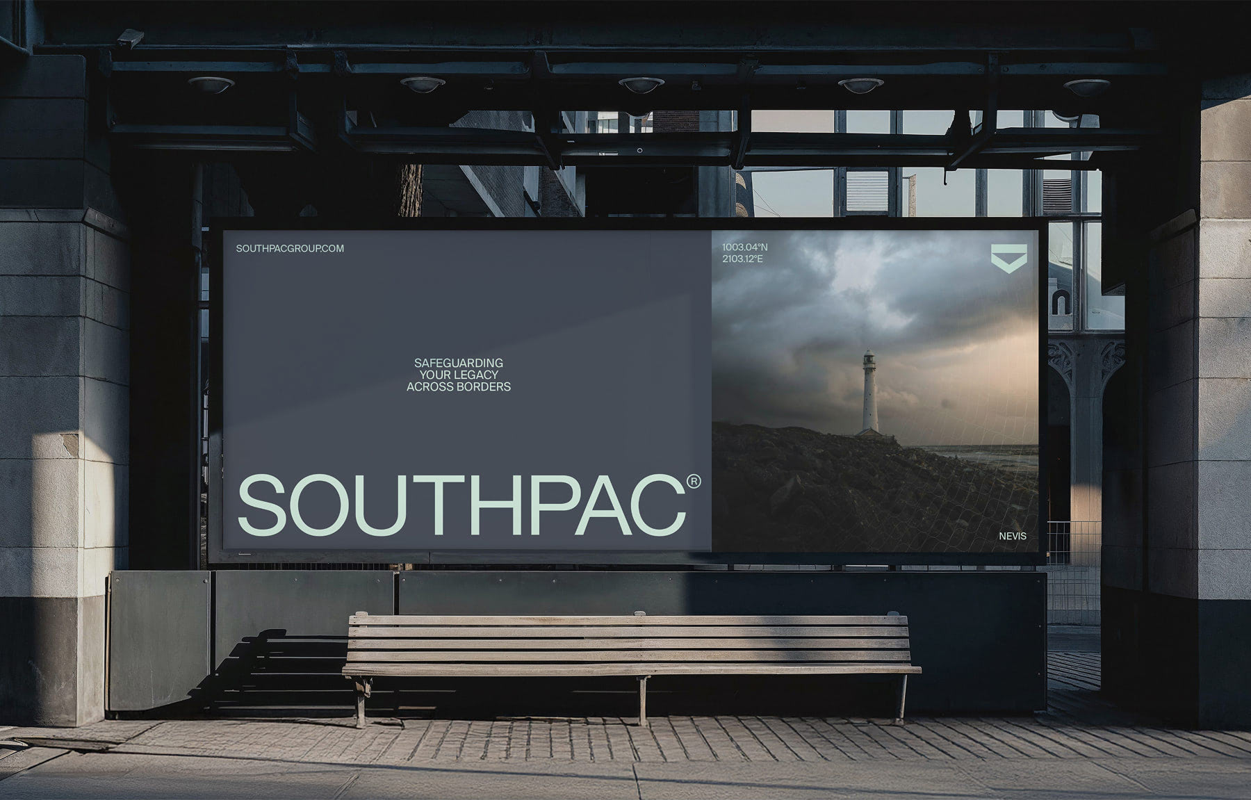
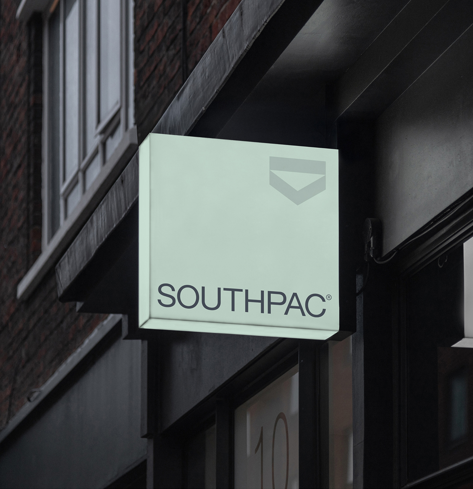
The refined wordmark is paired with a stylised shield to represent the company's heritage. A moody colour palette, along with stormy imagery, was chosen to reinforce the theme of protection and solidarity - even in turbulent times. Finally guilloché-inspired patterns and a simplified globe were designed as tools to help communicate the protection of assets across borders.
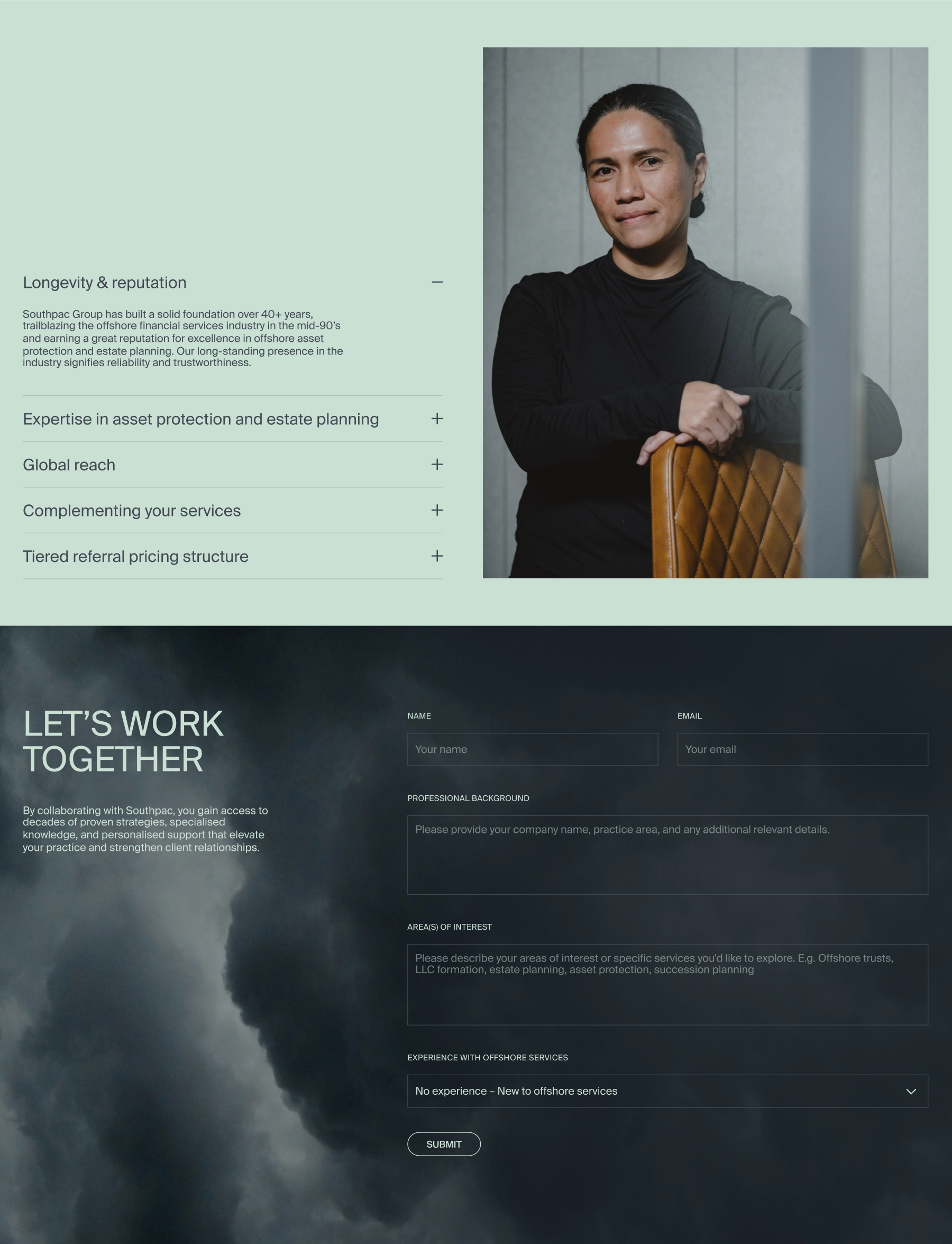
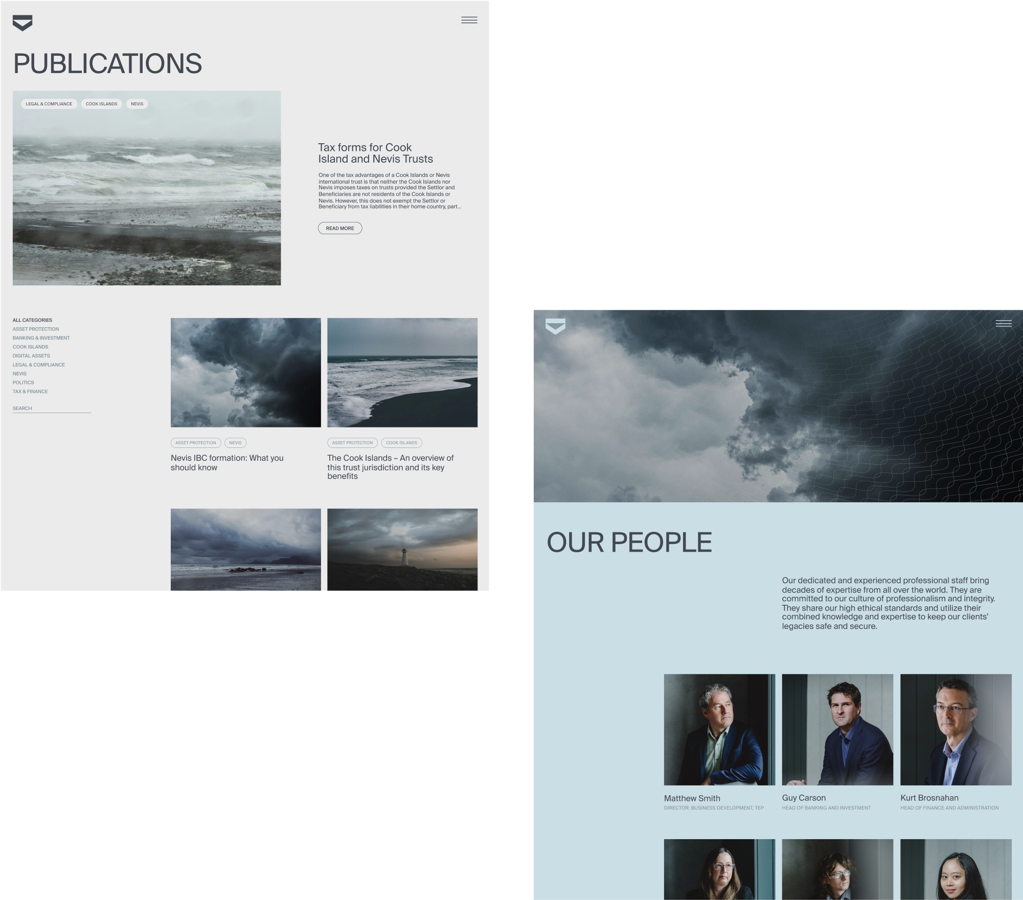
Supporting the rebrand, a dynamic new website was designed and developed as a showcase for the business and to better engage both referrers and clients. An extensive set of social and print assets were also created.
Southpac's new brand successfully provides the company with a distinctive presence and re-establishes it as the category leader.